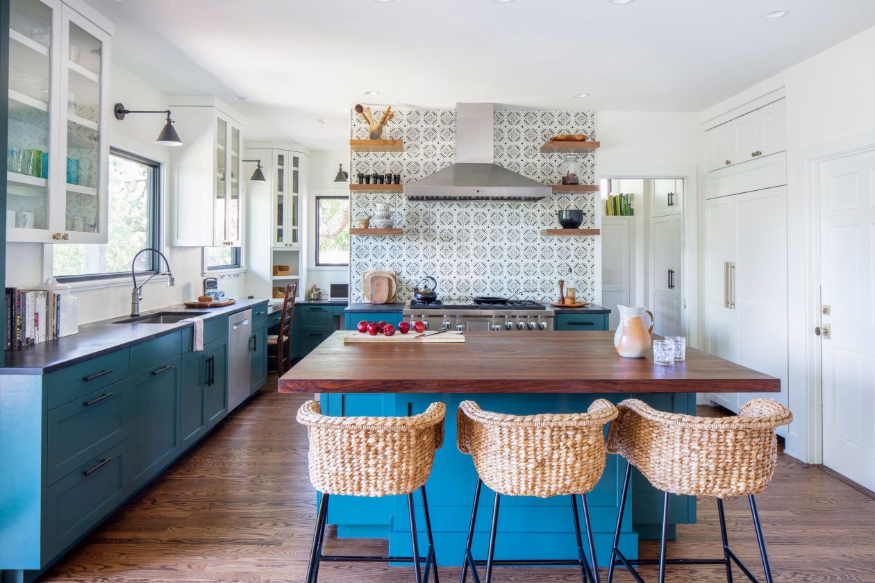
Tarrytown Full House Renovation
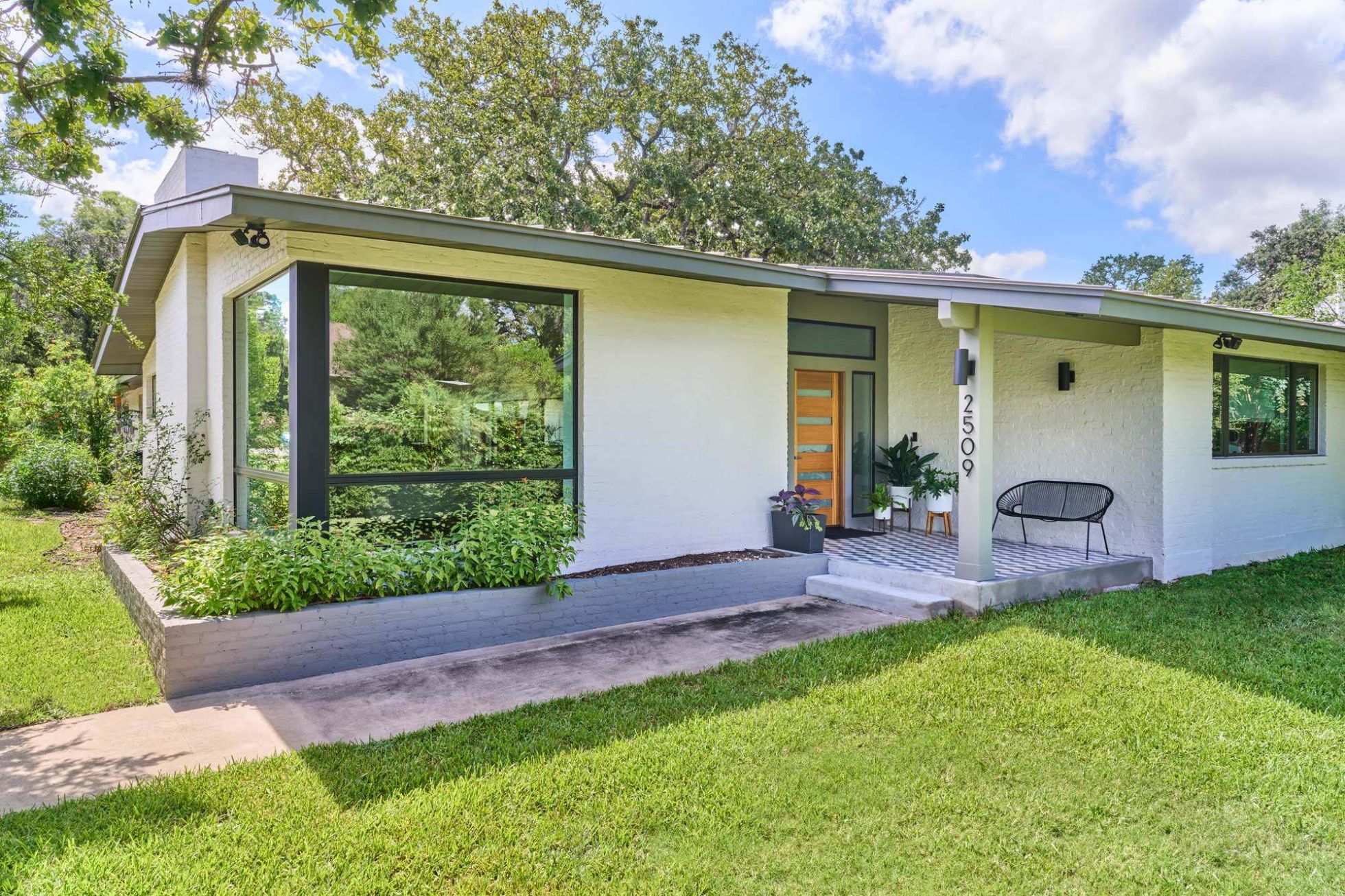
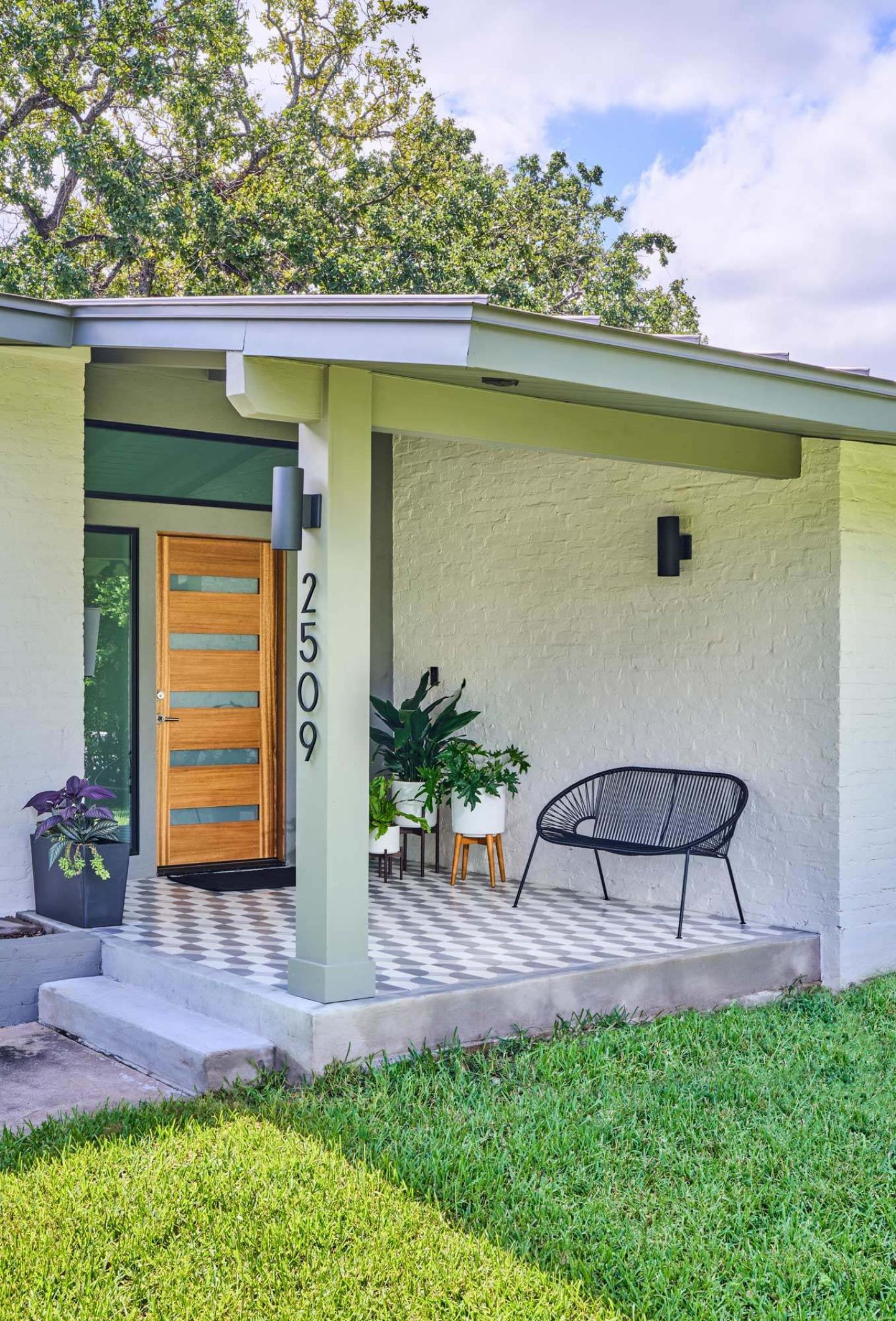
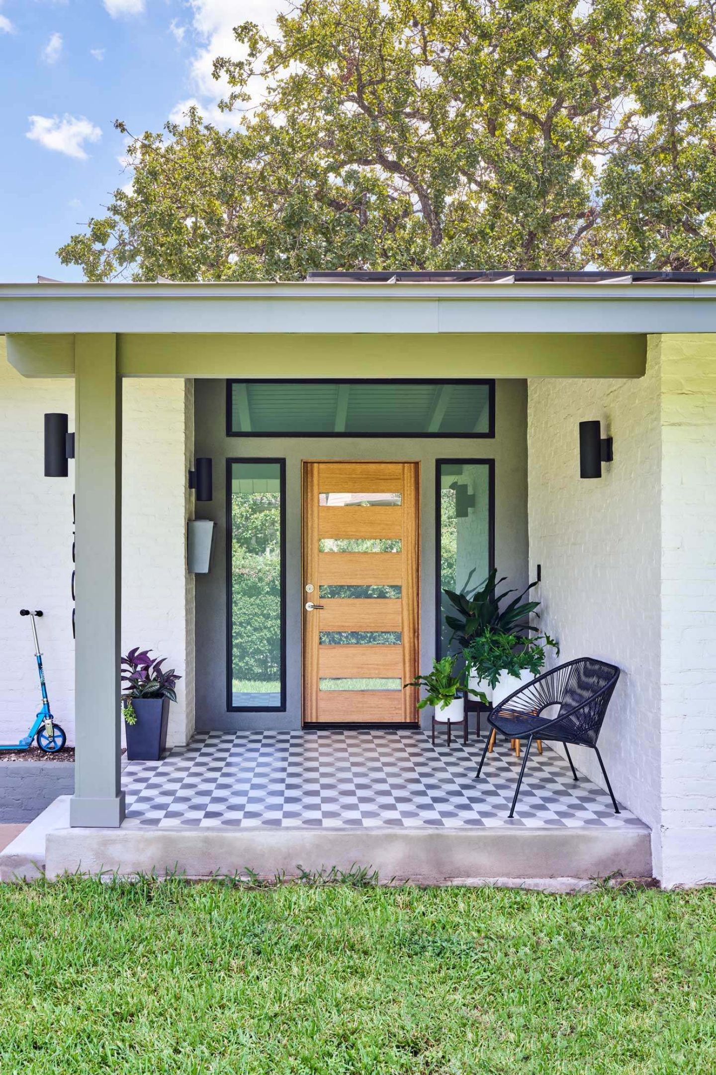
This family of four loved their home’s location, originally purchasing the house for its mid-mod vibes. But the house itself was overly compartmentalized and the previous owner’s updates were not in keeping with the midcentury architecture. After living in the home for several years, it was time to make a change.
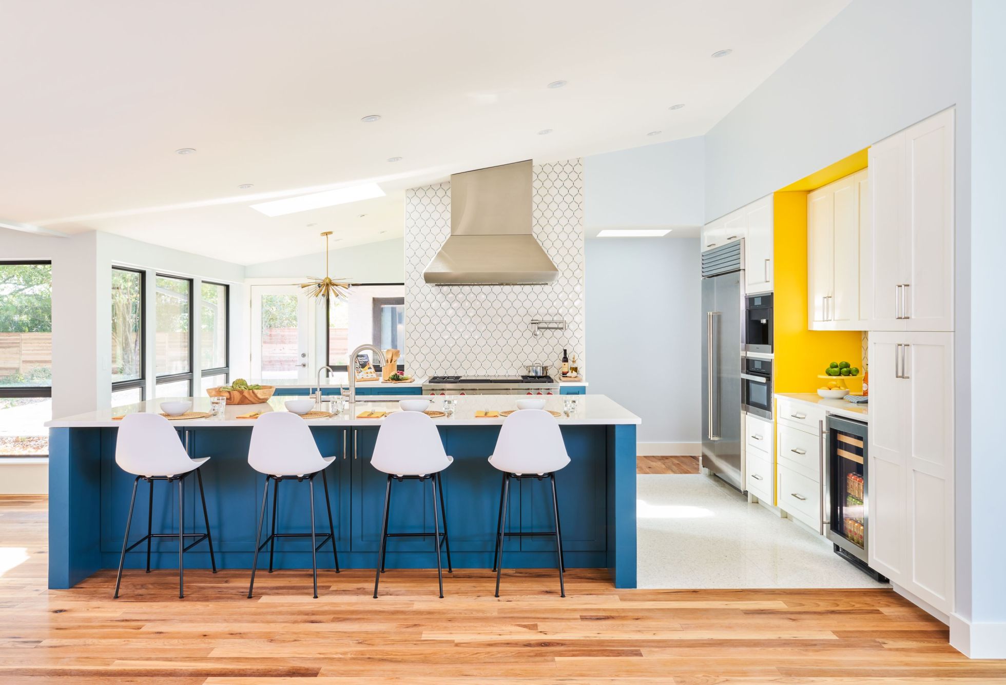
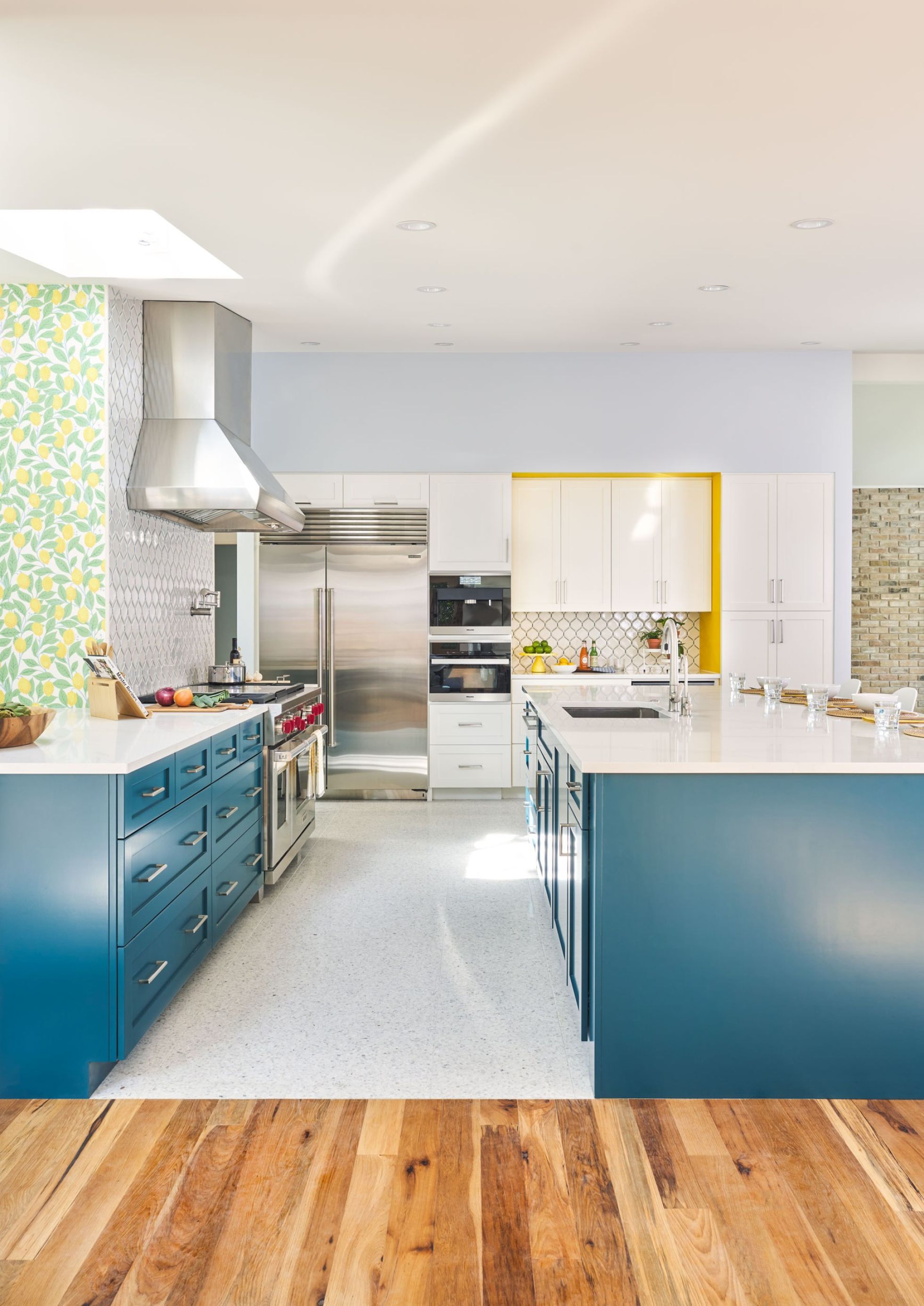
One of the main focuses of the renovation was the kitchen. The family really enjoys cooking and the kitchen is the central hub of the home. But it was disconnected from the rest of the house and closed off.
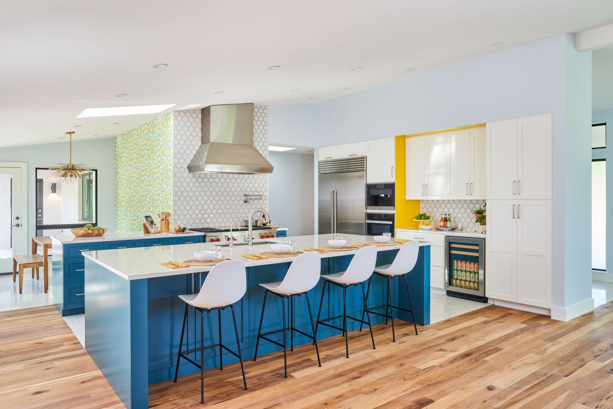
The original layout separated the living, dining and family room from the kitchen. The kitchen was also really big and had a lot of unused square footage. To create a new sense of connection, the walls between these rooms were removed allowing full sight lines between the spaces. Additionally, the floorplan was reorganized, offering up some of the original square footage to be used in other parts of the house. These changes greatly improved the flow of the kitchen.
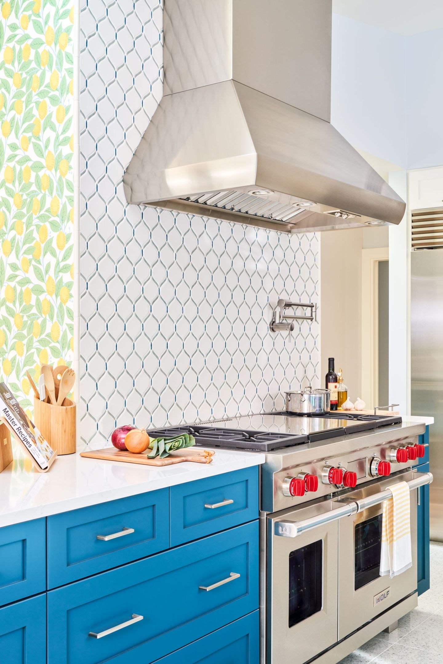
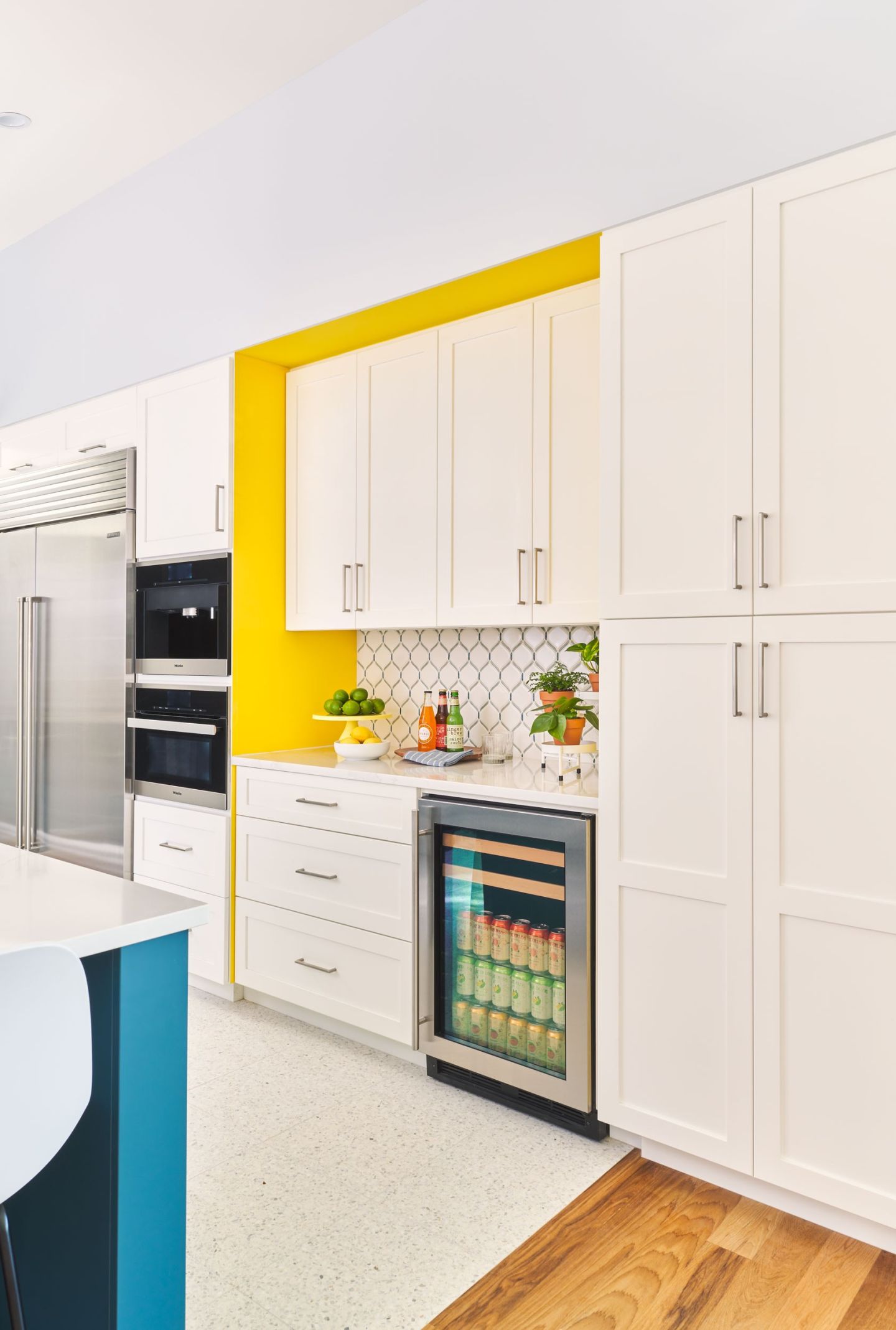
Because the family loves to cook together, it was important to have an island with plenty of seating. The island also features storage on both sides, taking advantage of its large form. While the previous kitchen had a lot of cabinetry, it was poorly laid out. The new cooking wall features pullout drawers for pots, pans and cooking utensils and has an appropriately sized vent hood above the new 48” dual fuel Wolf range. More cabinetry flanks the refrigerator wall and beverage center, and a new walk-in pantry is tucked behind the cook-top wall.
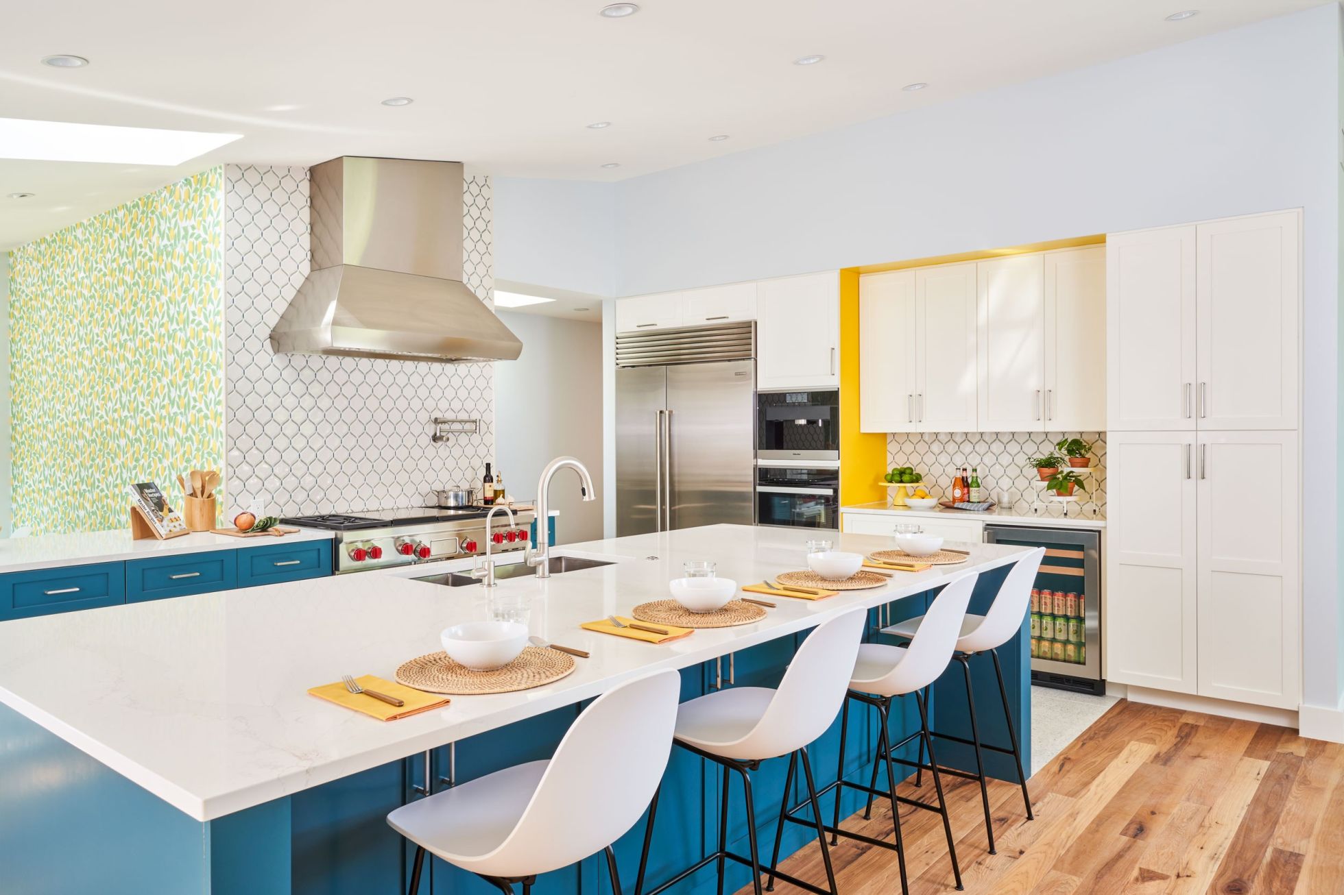
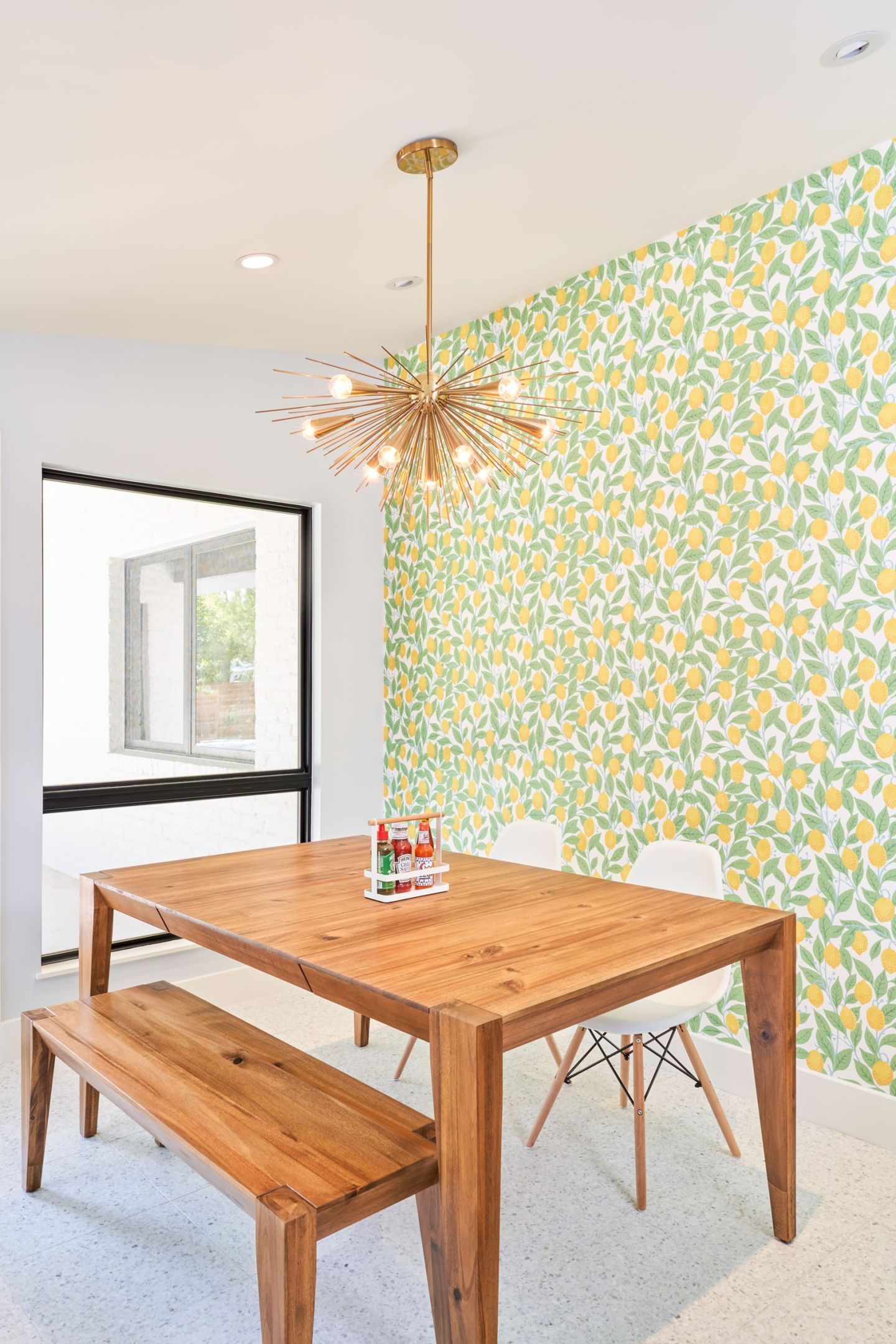
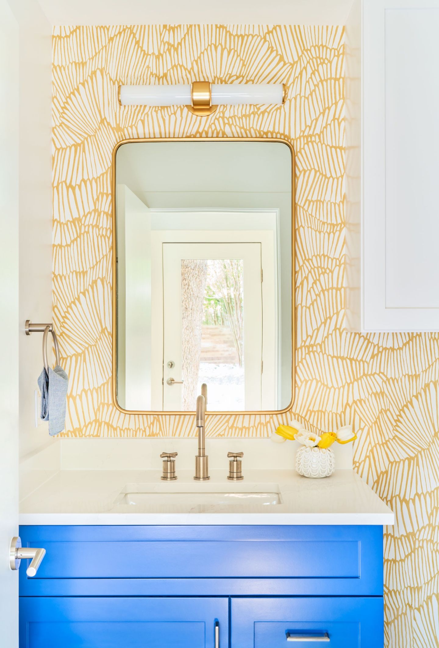
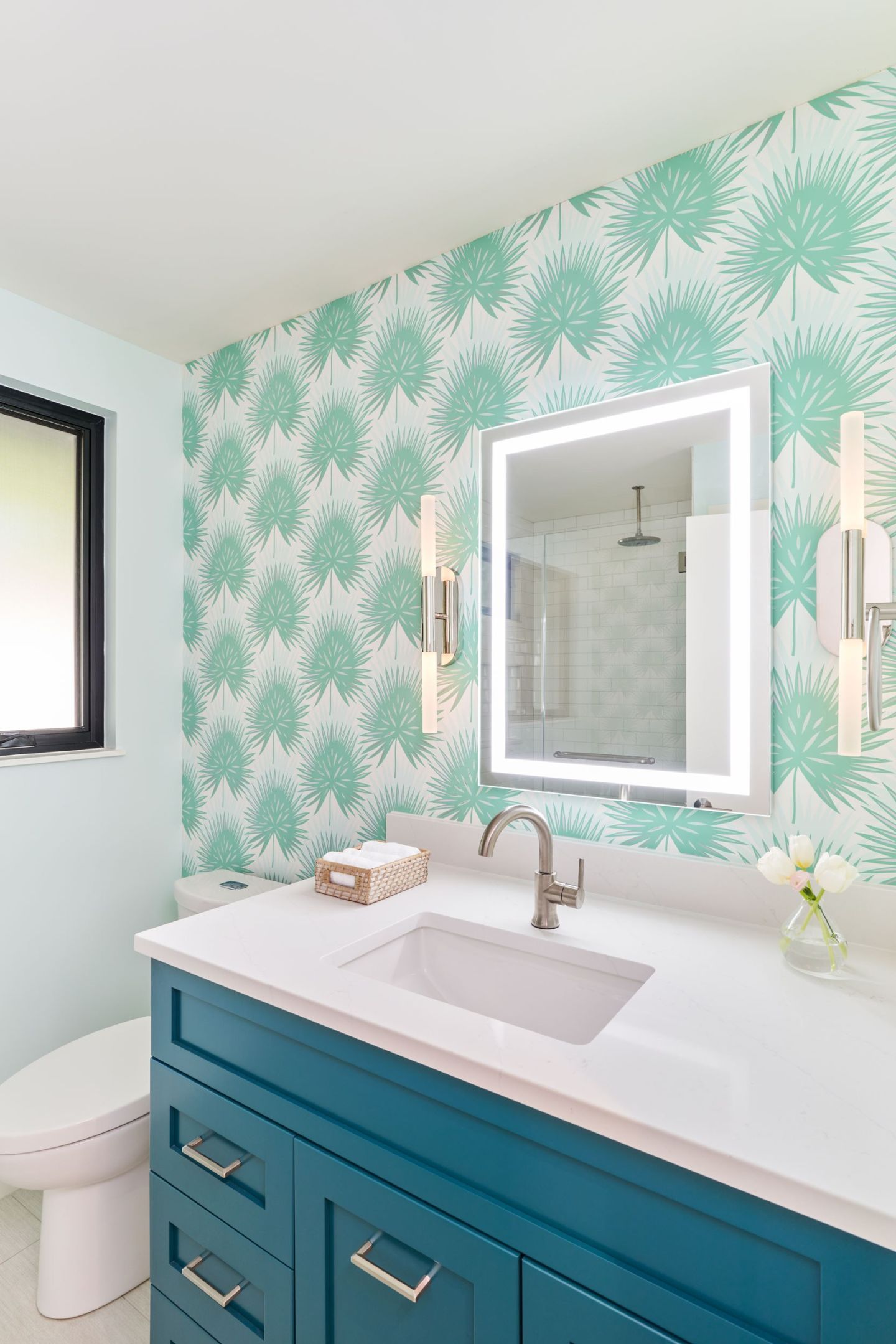
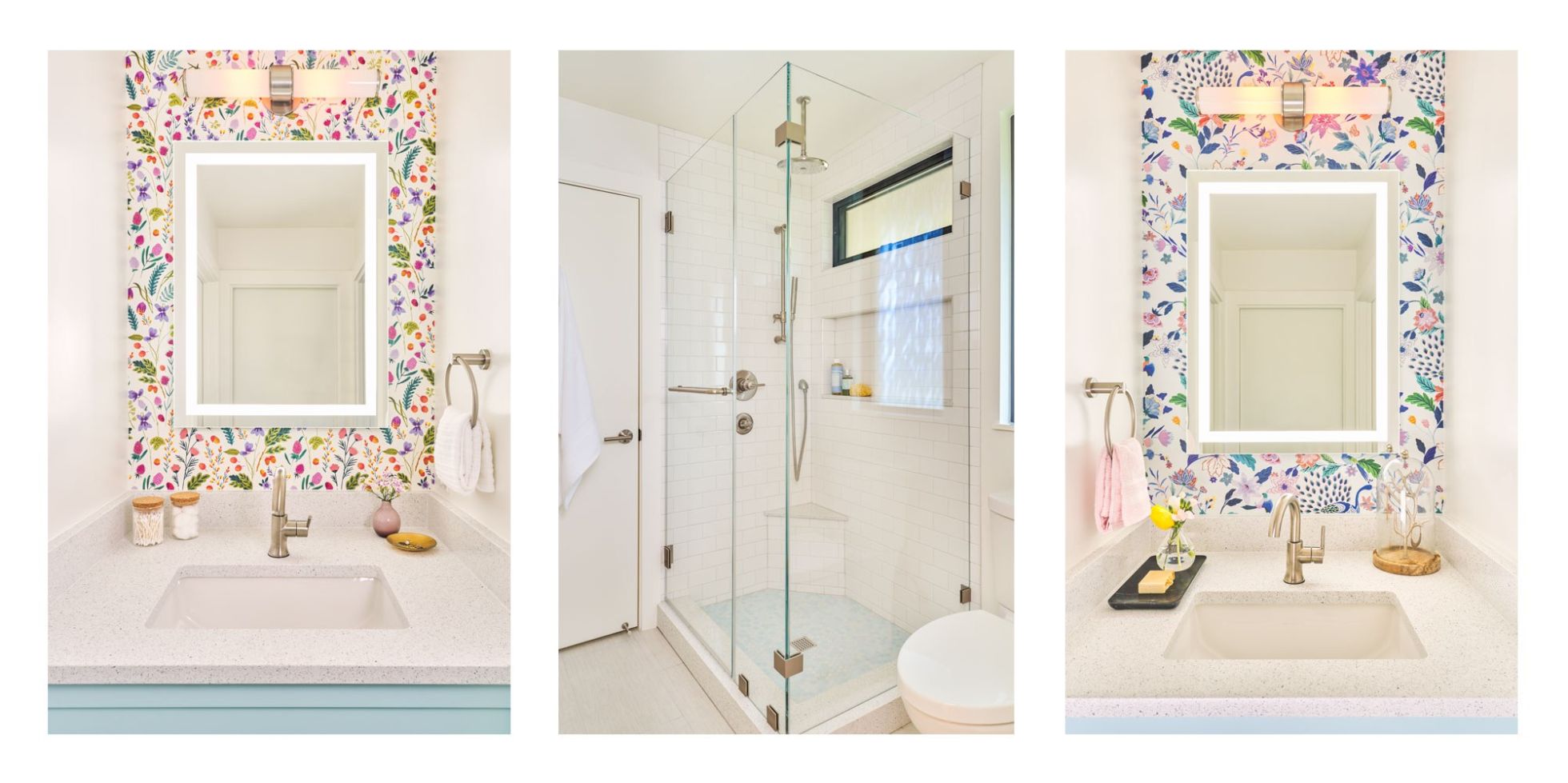
Regarding finishes, the clients wanted the house to be fun, colorful and reflect their family’s personality while also being kid and pet friendly. The tile backsplash was the main jumping off point. The project designer used the tile to inspire the new terrazzo flooring (a nod to the original house) and pulled the blue inspiration for the cabinetry. The breakfast nook dons a happy lemon wallpaper and a sunburst chandelier. Another fun detail is the pop of yellow at the drink center.
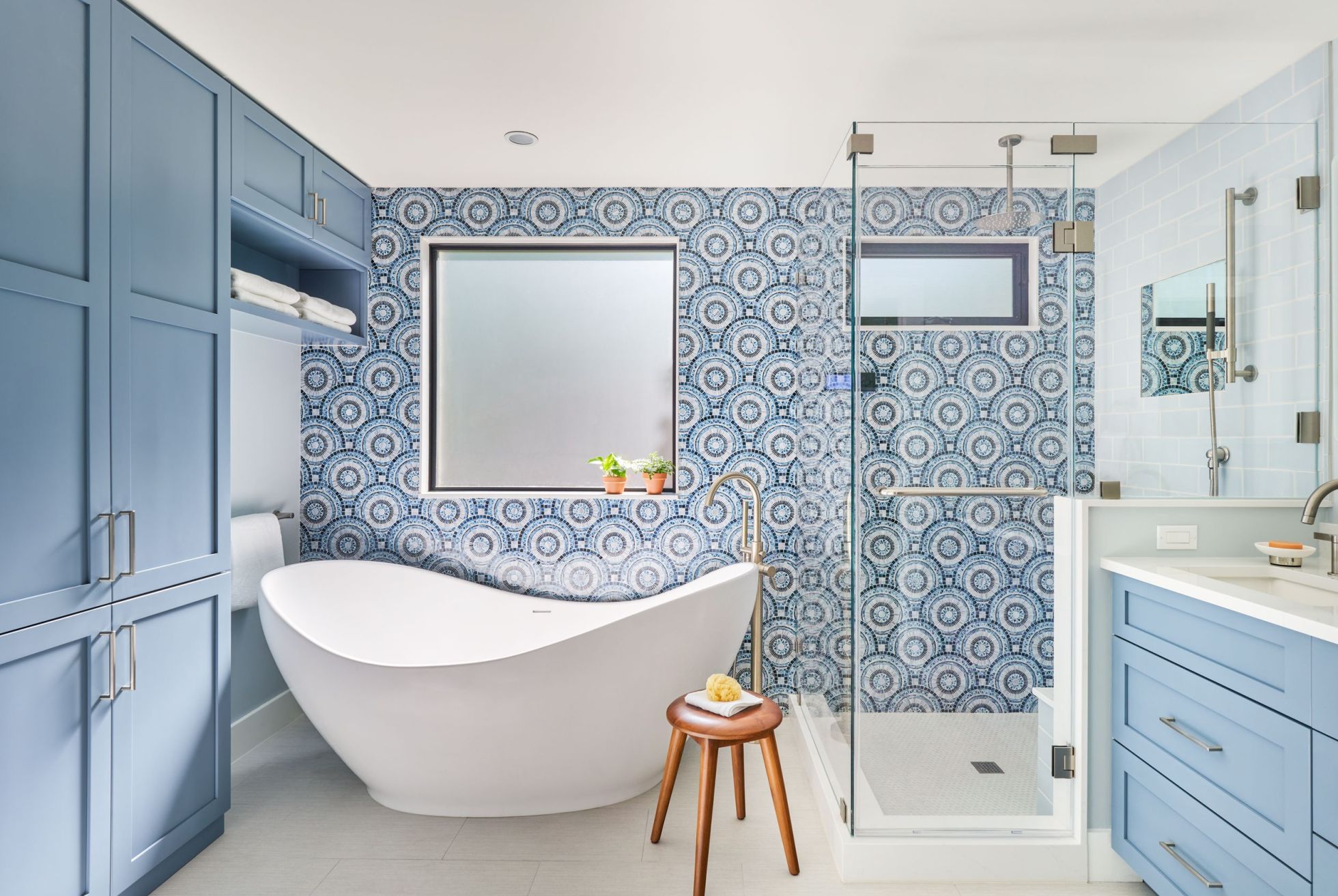
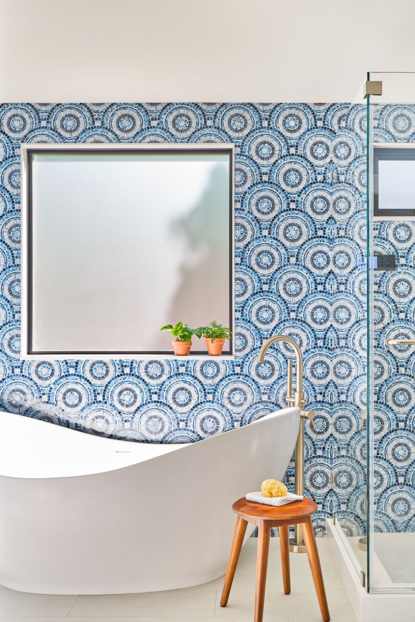
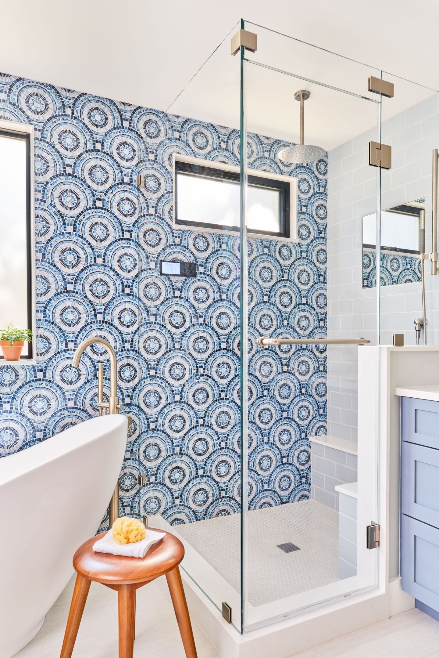
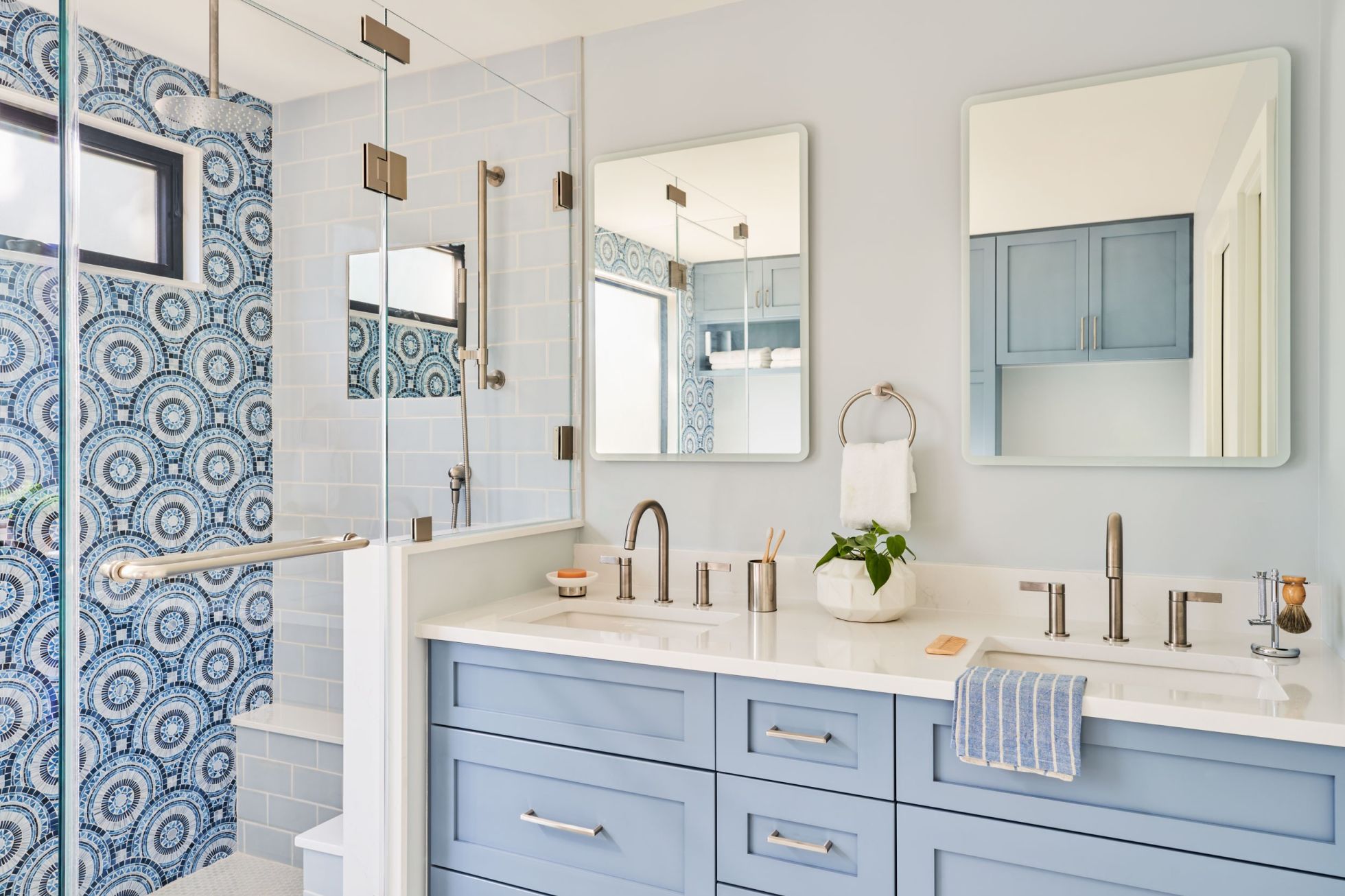
The original bathroom opened off the primary bedroom which was an issue considering the homeowners had different schedules. Because of this, it was important that the bathroom be accessed outside of the bedroom so as not to disturb the other person. Additionally, the bathroom was outdated and featured the classic corner shower, dated wallpaper, and 1950s cabinetry.
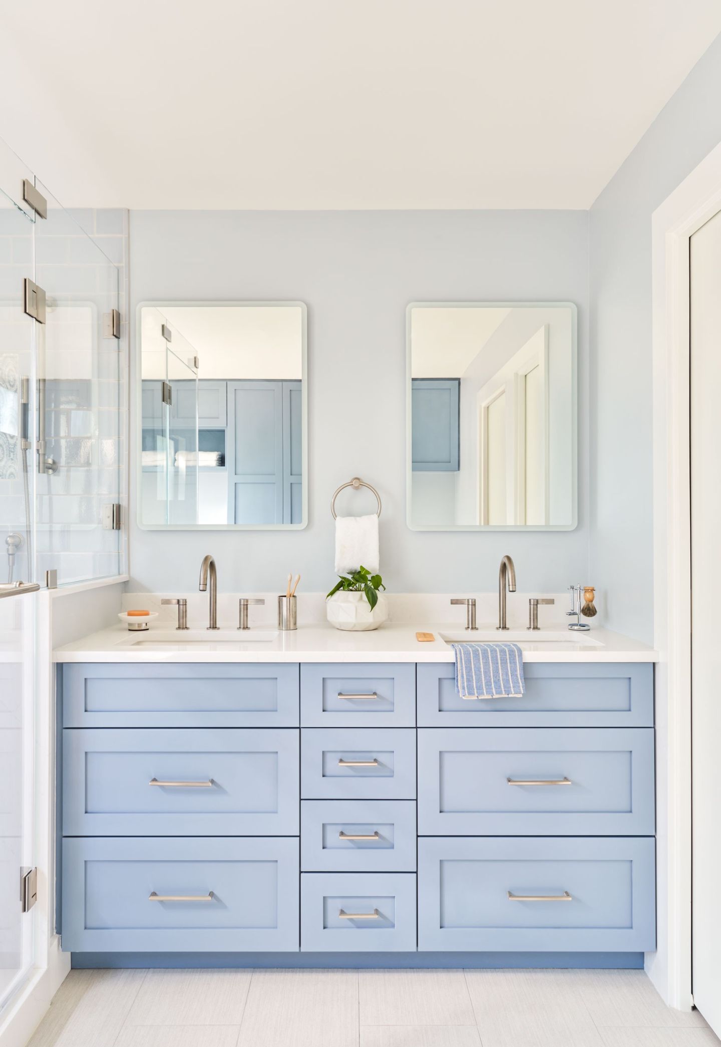
The new bath’s configuration changed too. The corner shower was downsized, allowing space for a new soaking tub (a “must have” for the homeowner). The double vanity downsized a bit too, but this did not compromise the bathroom storage. Instead, with the reconfiguration of the vanity cabinetry, the homeowners have more storage than before while also gaining a new linen closet. Floor to ceiling storage adorns the toilet wall.
Next Project Lost Creek Kitchen Remodel
With Future Outdoor Living Preview


