Westlake Downtown View
Cleaner, Lighter, and More Contemporary
This project started out, not with a master plan, but with the directive to solve isolated issues. It wasn’t until we were well down the road of design that spaces started to bleed together, generating a more comprehensive overview. To make it more challenging, the home had been remodeled twice in the past, leaving an ad hoc series of peculiar room arrangements. Eventually, as one improvement led to the recognition of another, we touched every space in the home.
The original home had terracotta tile floors in most rooms, heavy mahogany trim and cabinetry, and yellow painted walls. It was relatively dark and didn’t take advantage of the amazing skyline view right outside. Our clients sought a cleaner, lighter, more contemporary feel throughout that would showcase their art collection.
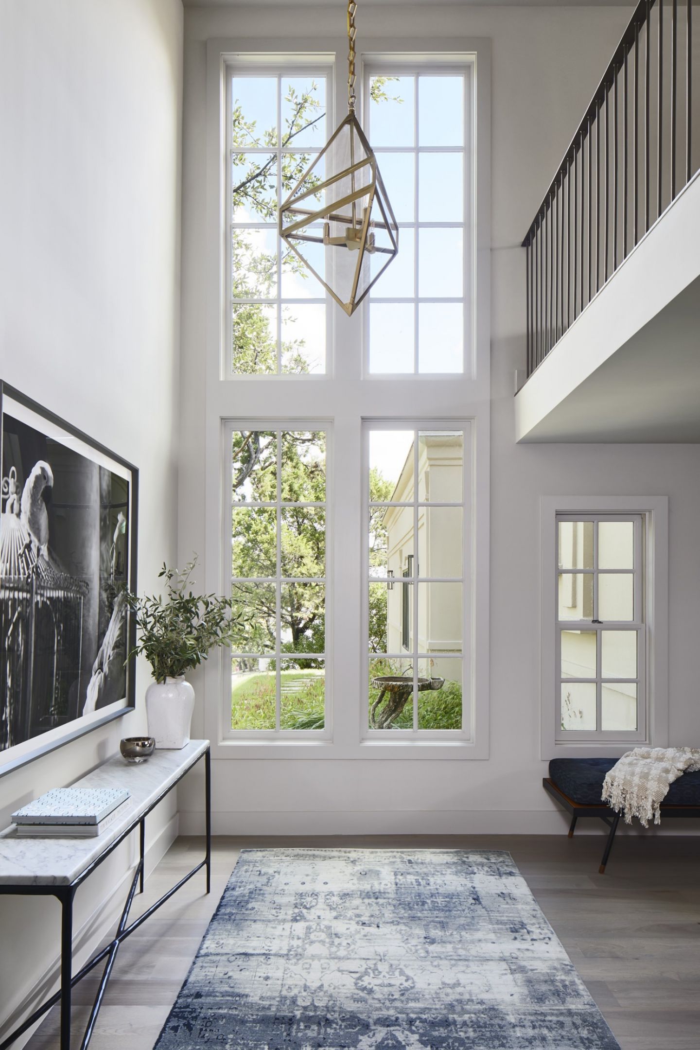
Being careful not to ‘give away’ the amazing view too early, the entry foyer was updated to improve the flow of the home and increase the natural light in the dining area.
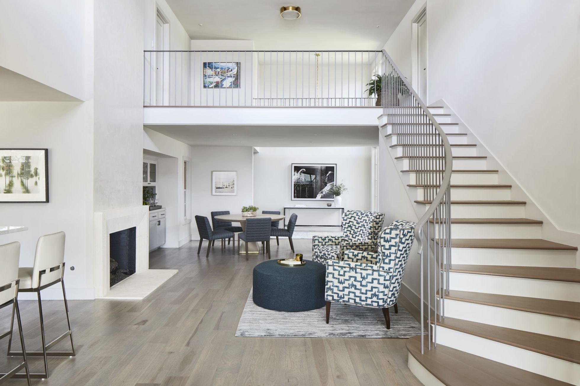
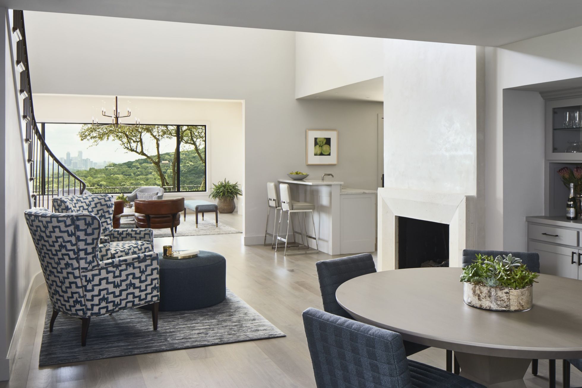
We gave the dining room fireplace a new limestone surround to provide a quiet modern accent that didn’t compete with the winding stair.
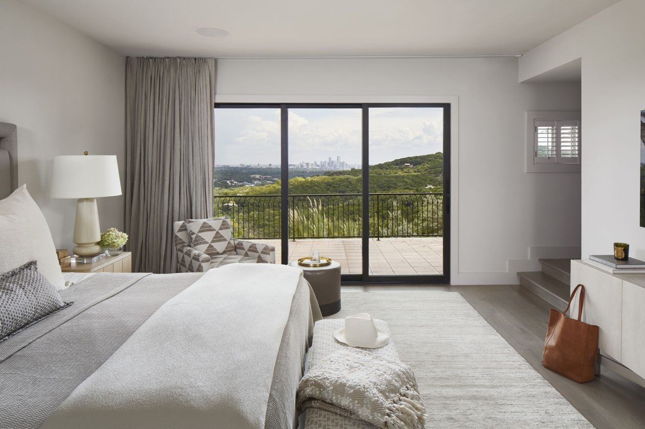
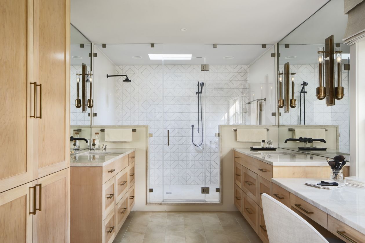
The master suite and guest bath were highest on the priority list. The master bedroom just didn’t feel good. It was dark and closed off from the exterior, and the ceiling was too low. The master bathroom was dated and needed a full overhaul. For master closets, the space afforded was neither sufficient nor appropriate for a home of this size. All total, this wasn’t an issue of needing more space but in instance where a better allocation of space would provide solutions to multiple problems – all with no need to add on to the home.
The first step was to make the master bedroom smaller. While this sounds counterintuitive, it corrected the proportions of the space and gave the room a much better feel. As a bonus, the leftover space was then used to increase the master closet to a size better fitting the house and more appropriate for the client. Adding a large slider better connected the room to the outside, brought in light, and captured the stunning view. Who wouldn’t want to wake up in the morning and ponder the city skyline from a verdant perch in the hills?
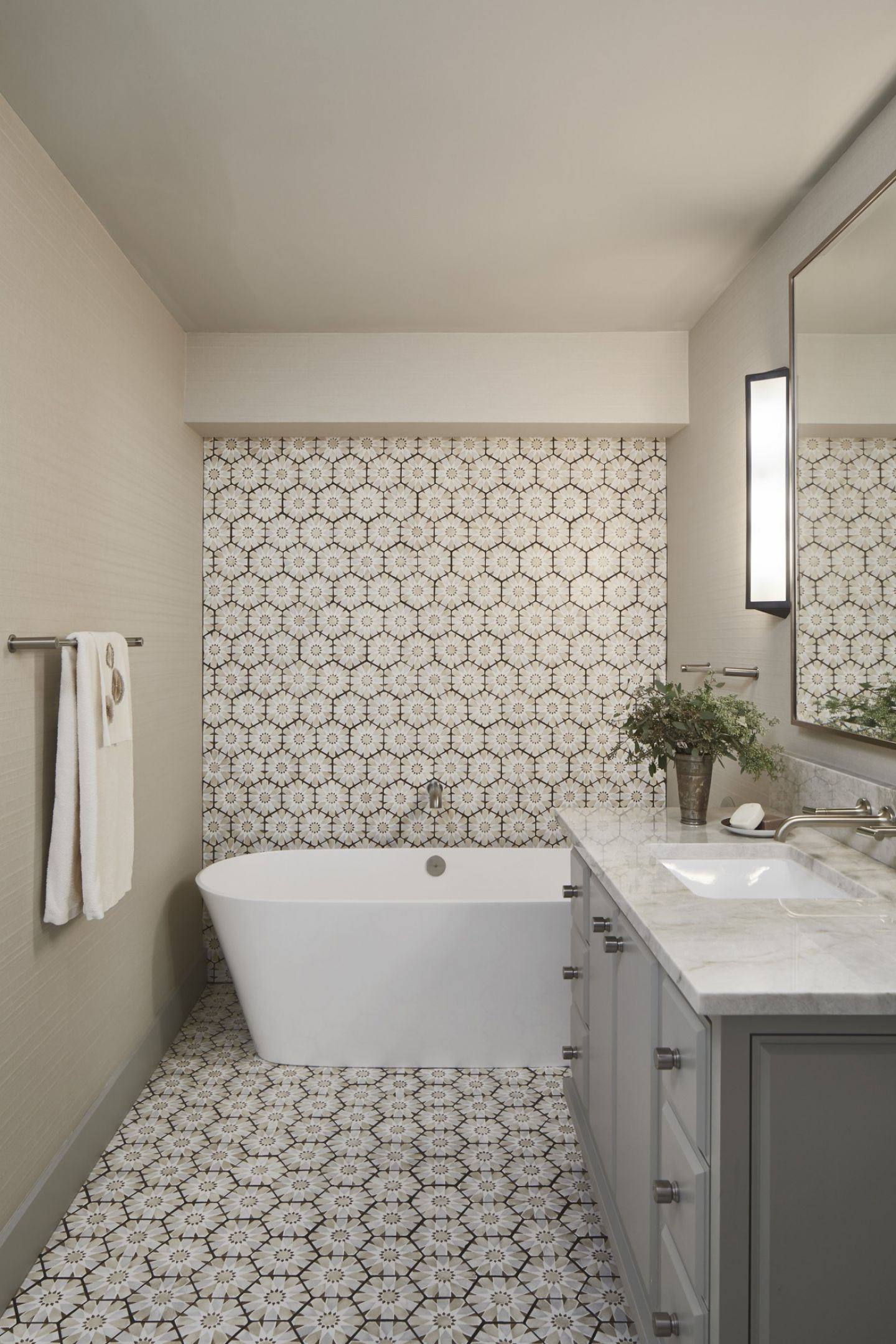
An example of past iterations of the house wreaking havoc on a modern layout was found in what would become the guest bath. This was, once upon a time, a jack and jill bathroom joining the current media room to the current office. With no need to access the bathroom directly from the office, that connecting hall was easily forfeited to the master bathroom and is now the master shower. The remaining compartments of the jack and jill were cleared out, leaving a large open bathroom—perfect for a therapeutic soaking tub.
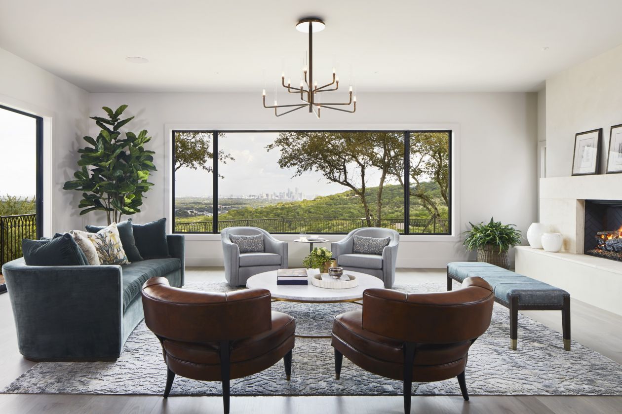
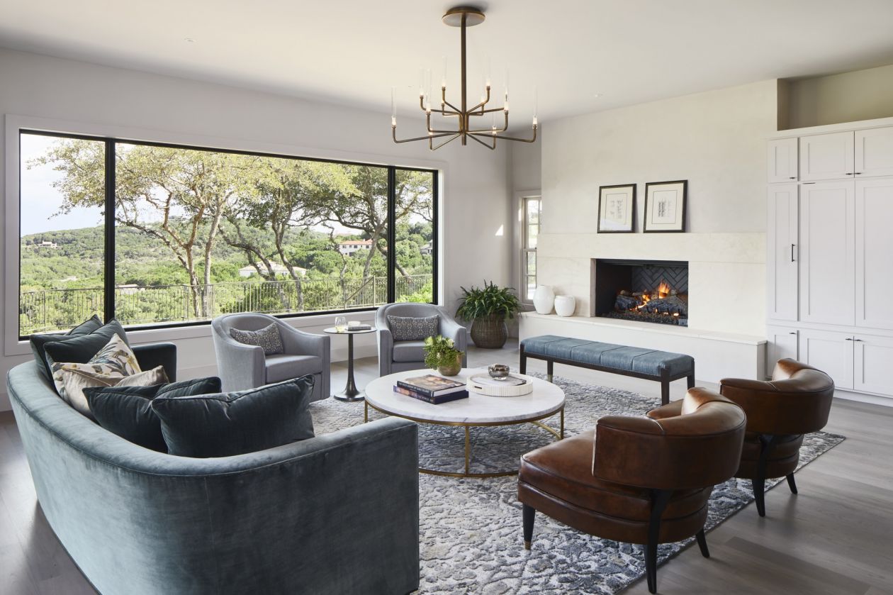
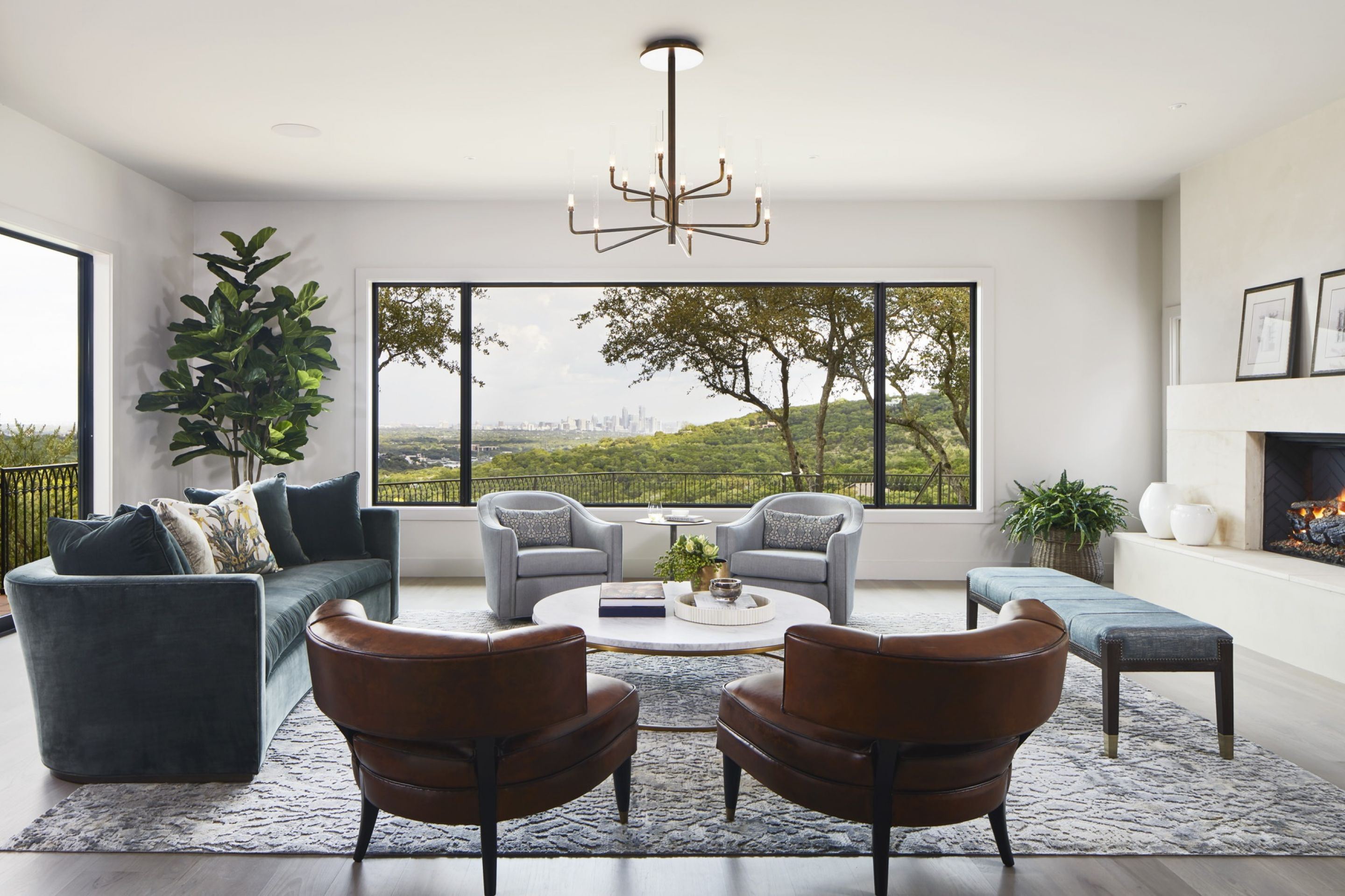
One of the overarching goals of the project was to better visually connect the inside and the outside—particularly the view. In the living room we installed clean, wide-format windows to take in the sweeping view of the city and landscape beyond.
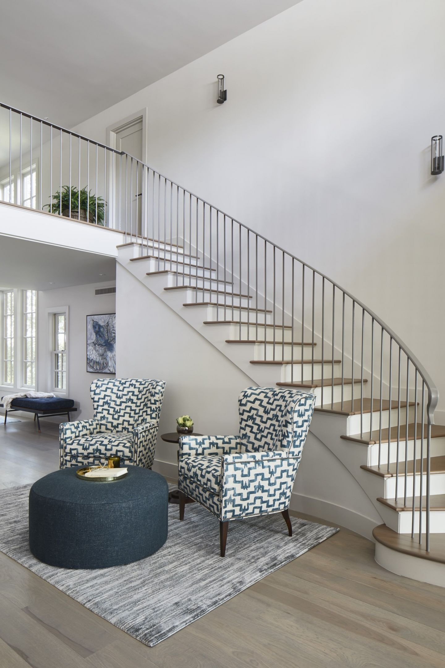
Another global goal was to lighten and brighten the space. Walls throughout the home were refloated to a level 5 finish, effectively erasing the heavy texture. Mahogany crown moldings were removed to allow the eye to wander to the ceiling instead of stopping at that dark line, making the ceilings feel taller. Venetian plaster was added in select areas for visual interest and to provide a subtle texture change while adding elegance without being too formal. The original mahogany floors were replaced with hickory, then site finished to a warm grey. Stair treads were refinished to match the floors.
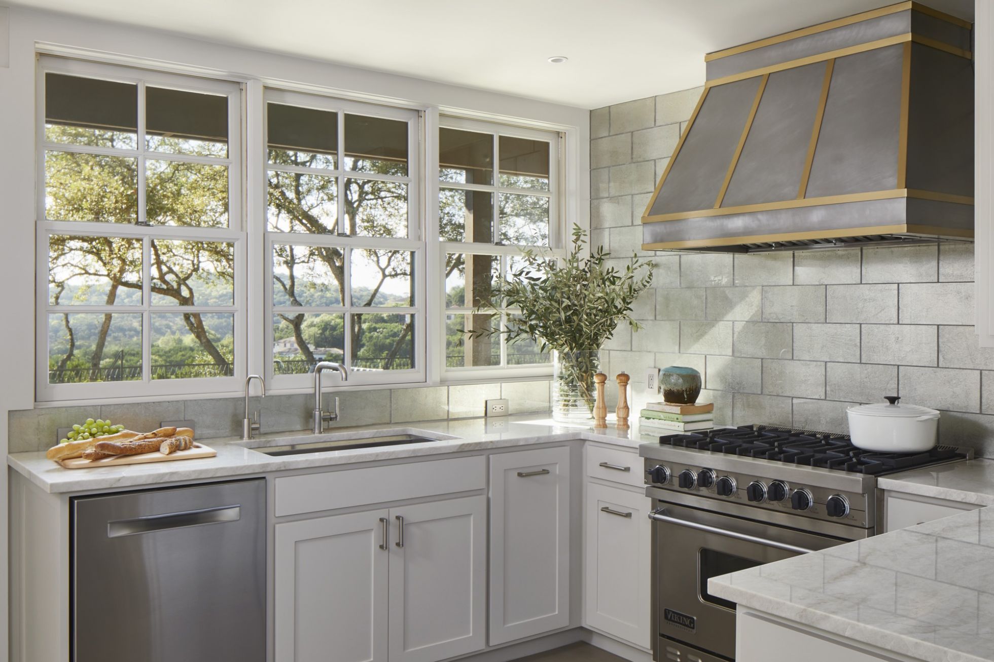
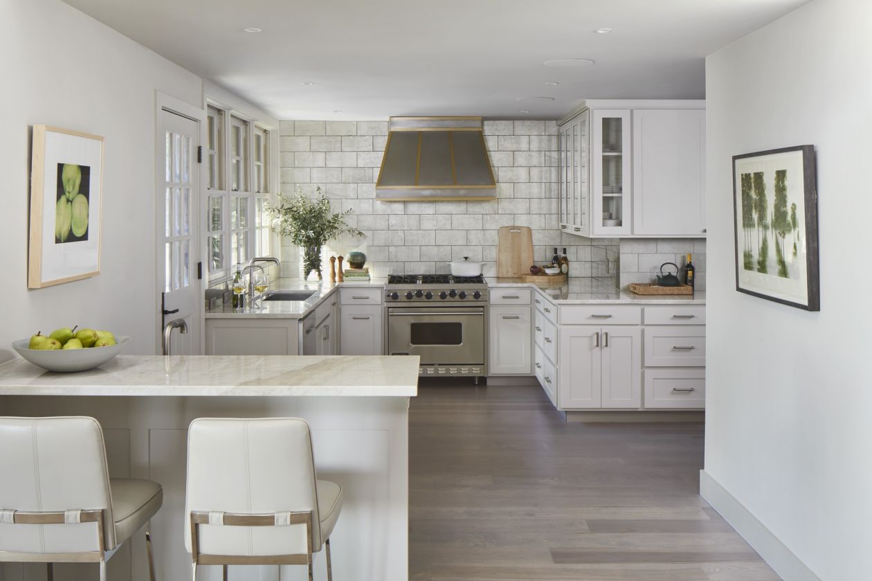
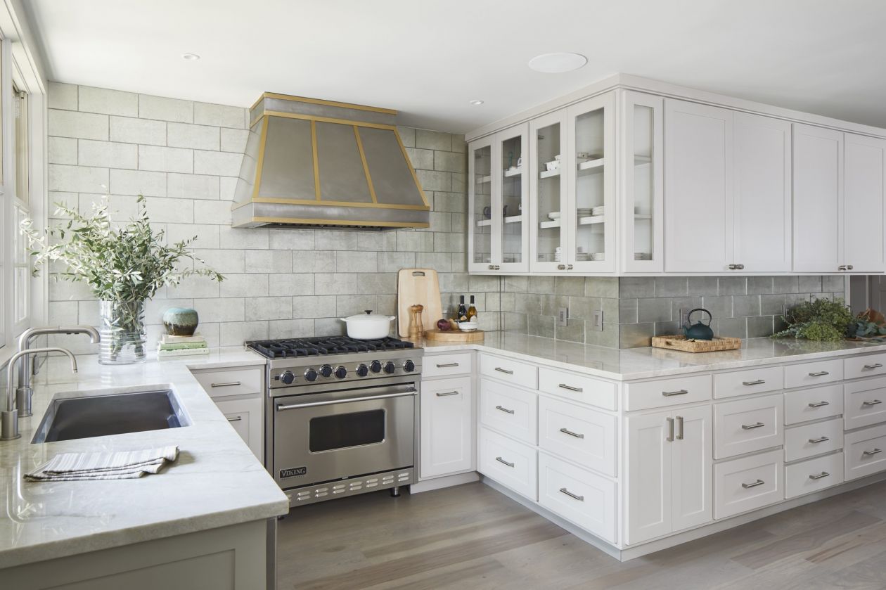
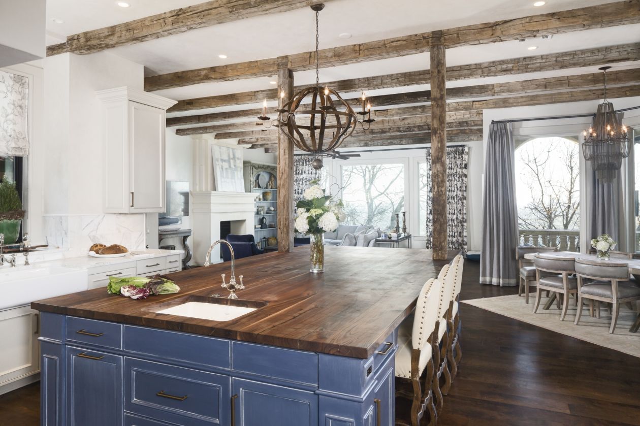
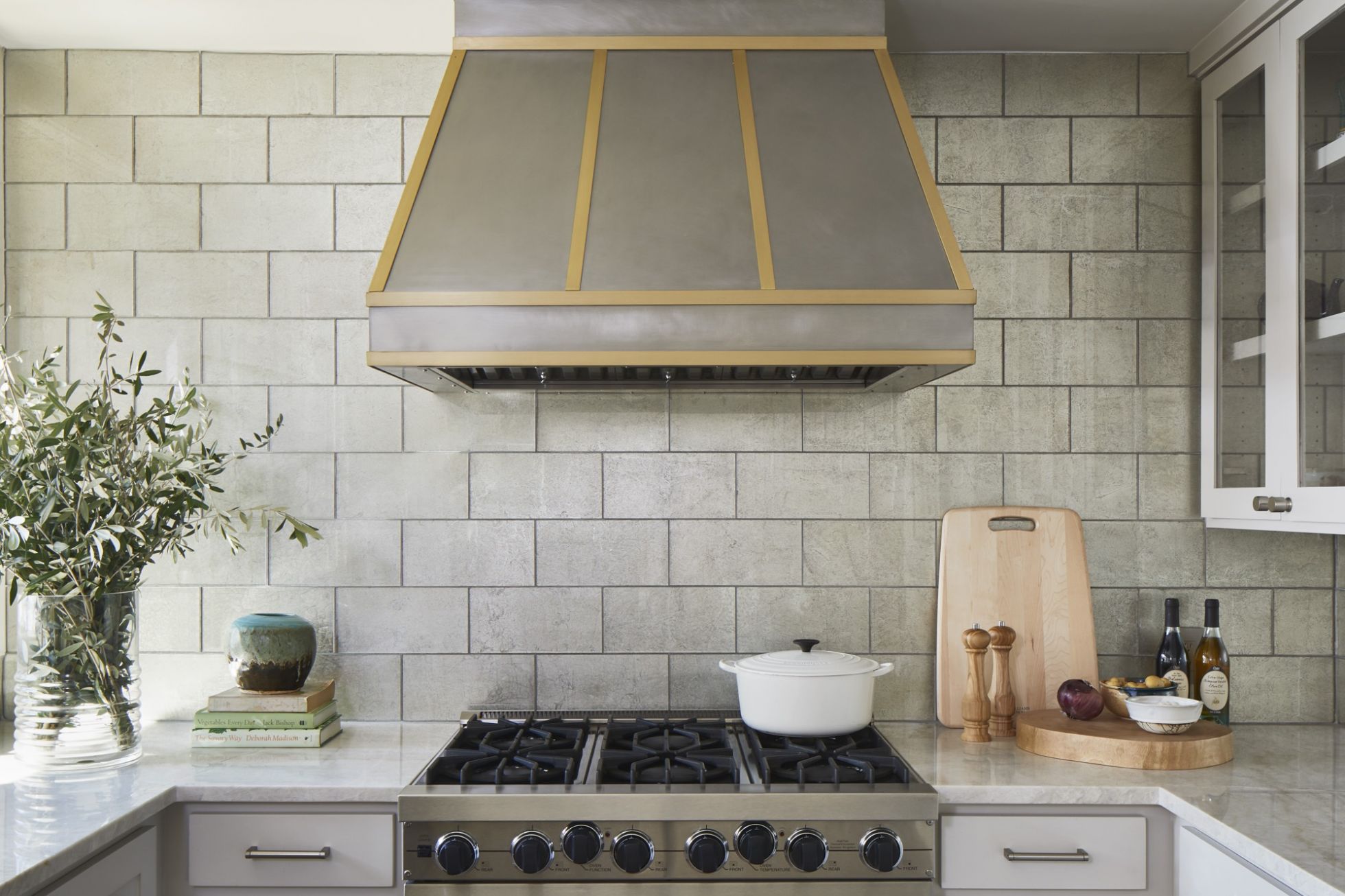
Our clients weren’t particularly in love with their kitchen. Keeping the original configuration, we replaced the countertops, backsplash and cabinet hardware. Once the third party interior designer GREER was aboard, the clients agreed to paint the cabinets, then to ‘go for it’ with a custom range hood making for a full refresh in the kitchen.
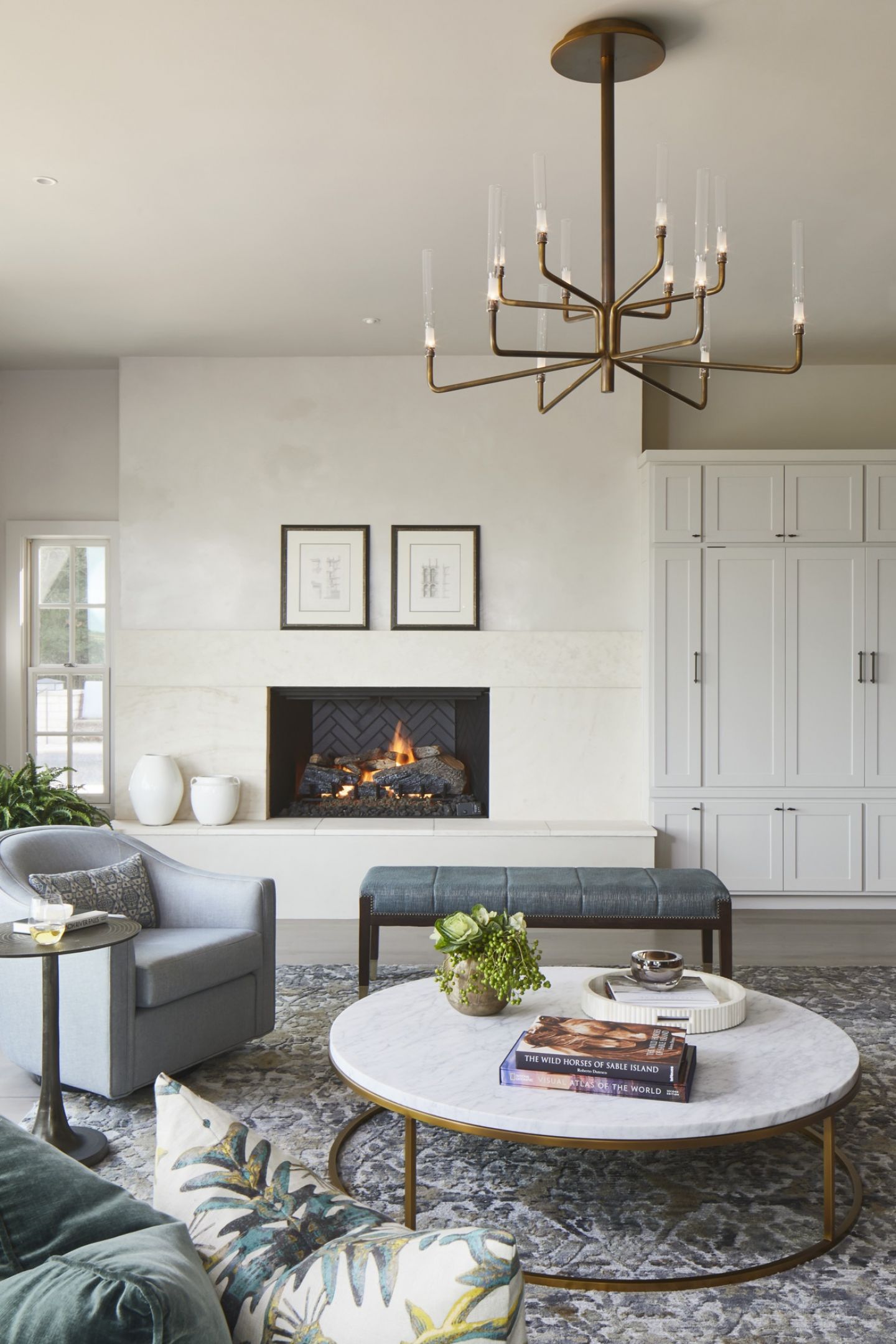
Much like the kitchen cabinets, certain elements of the project took time to make their way into the scope of work. The fireplace in the dining room was an early scope element, but the living room fireplace came into scope later, during construction.
By taking out the original mahogany cubbies that flanked the firebox opening on either side, we extended the surround and hearth to the edge of the wall and the adjacent cabinets, at once increasing the fireplace’s presence in the room while decluttering the space. The adjacent cabinets to the right of the fireplace were kept but were repainted to further brighten up the room.
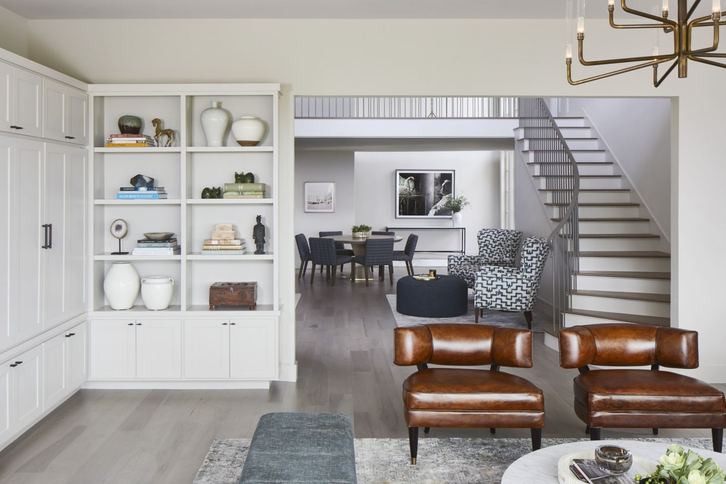
While initially planned to only receive a new tread finish, the winding stair received a new railing toward the end of the project, once the surrounding finishes were complete and it became clear to the client that the original railing would ultimately look out of place in their newly outfitted home.
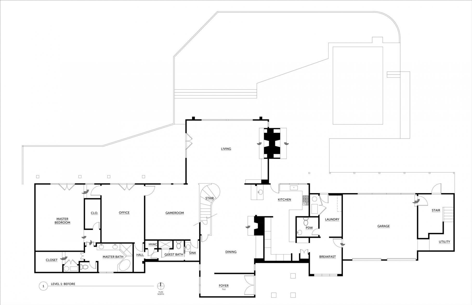
Level 1 Before
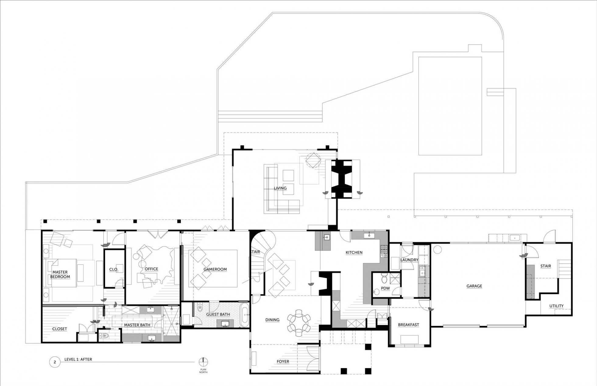
Level 1 After
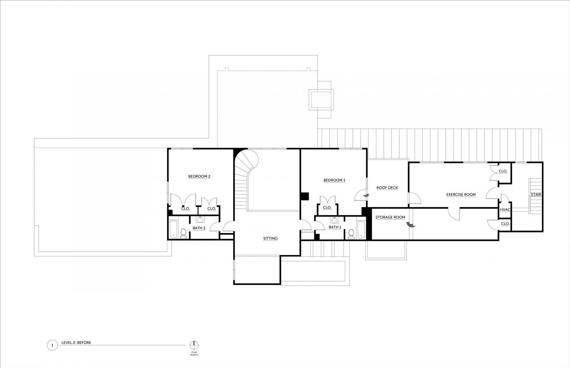
Level 2 Before
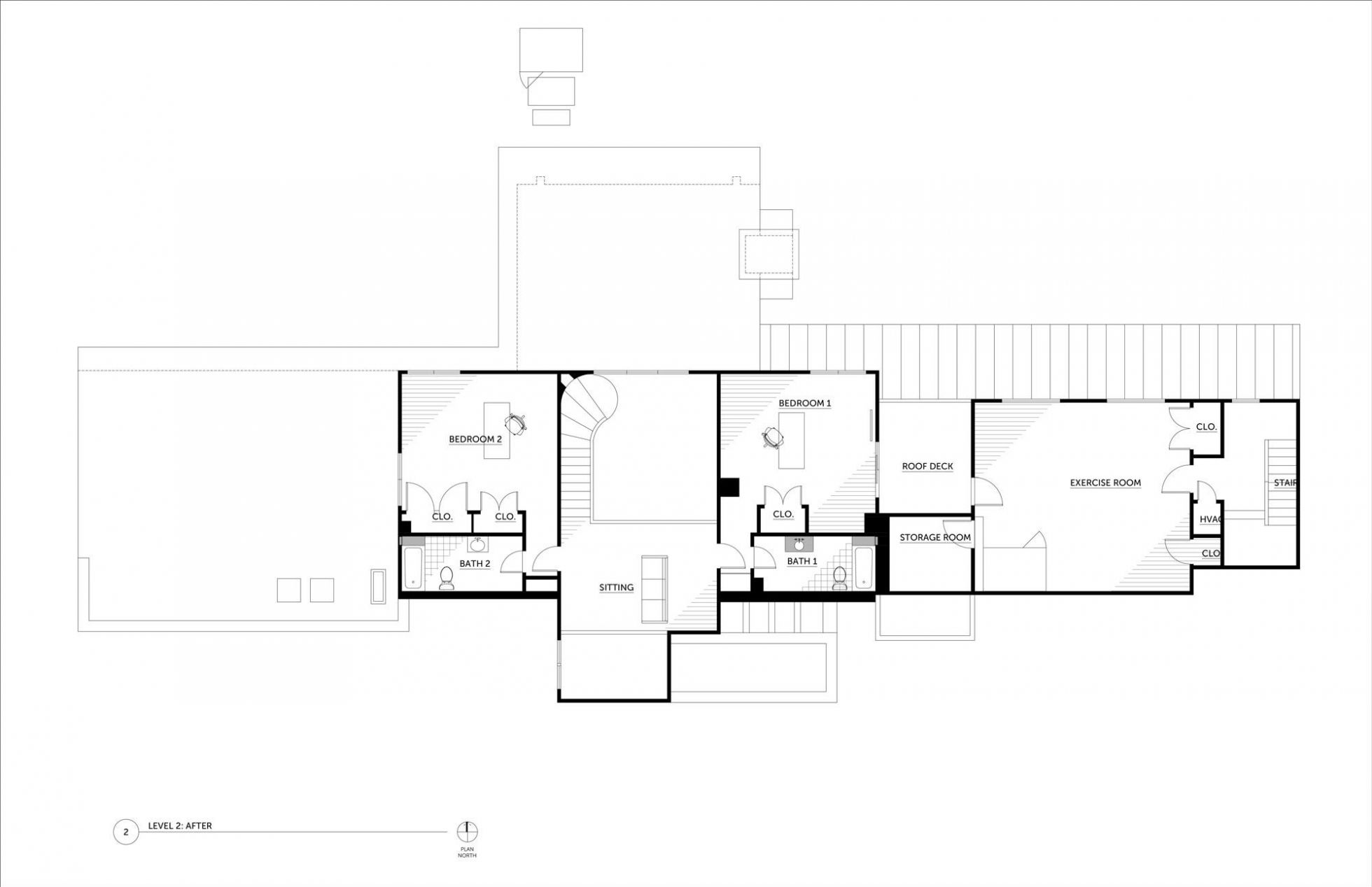
Level 2 After
The domino effect: a cumulative effect produced when one event initiates a succession of similar events. How the need for new bathrooms sparked inspiration to renovate the whole house, now this home truly is a cleaner, lighter and more contemporary feeling home than its previous self. Now it’s the perfect house to kick up your heals, grab a drink and watch the weather roll in.


